Rules for Herds
by Mark Meyer · Posted in: photography techniques
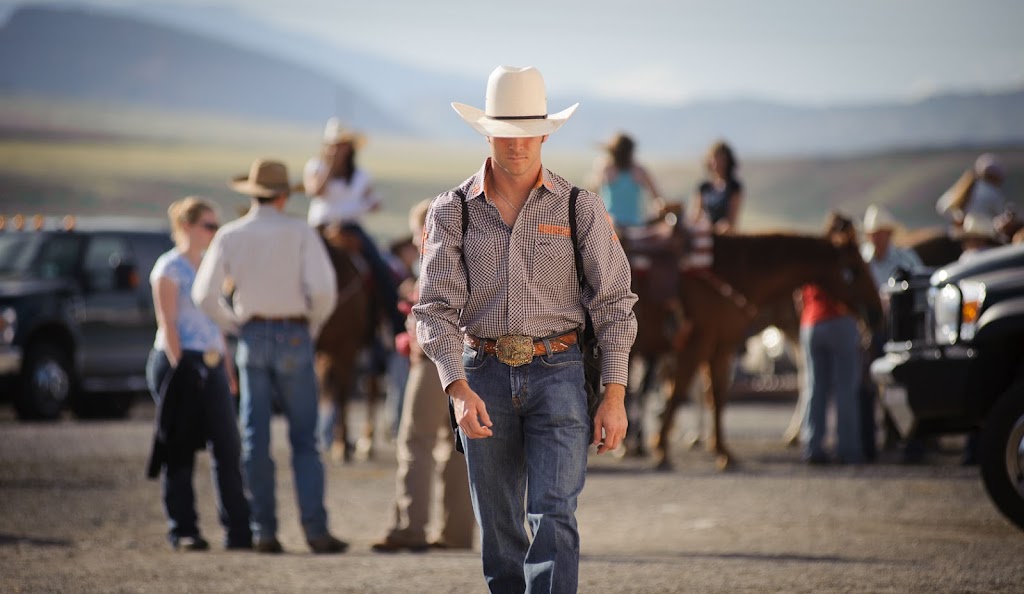
The rule of thirds is perhaps the greatest fallacy ever foisted upon the beginning photography student, a canard from lazy educators designed to give the impression that their ideas are based soundly in theory. You'll find it in almost every elementary photography book. The author will often backtrack with a stern reminder that rules are meant to be broken. But a rule that's broken as often as it's not is no longer really a rule; it's a coincidence. This is often the only concrete advice you'll find about composition in a photography primer. The author will generally follow it with some vague words about diagonal lines and encouragement that eventually your eye will develop and you will just learn 'to see.' In other words, I can't really teach you anything because I do it intuitively, but here, take this rule instead. This is just lazy.
Now pick up a book on cinematography. Here you'll find a long discussion about space, perspective, movement, surface division, linear motif, visual rhythm, and much more. In a primer. This material encourages students to understand how our three dimensional world is translated into two, what kind of assumptions our visual system makes regarding distance, size, movement, and how to understand visual tension and the viewer's expectations as they relate to story telling.
Why are young cinematographers exposed to so much useful information while young photographers are given the rule of thirds and a pat on the back? I think part of the answer is that photography has a long amateur tradition that cinematography doesn't. Companies, like Kodak, with an interest in selling easy-to-use cameras had a financial incentive to show their customers how to take passible, if mediocre, images right out of the box. They developed little shortcuts like, 'put the sun over your left shoulder' which avoids the exposure difficulties of more interesting light. Photography education picked up the tradition and became a system of tips and tricks.
There's simply no time for that in the world of cinema. You need a solid foundation from the beginning or you'll be costing somebody a lot of money. The financial incentives are different. Also, unlike still photography, cinematography is almost always a collaborative process, which requires a shared vocabulary among a team. A director needs to be able say 'flat space' or 'open space' and have his idea understood. For a dramatic comparison, open up issues of Popular Photography and American Cinematographer side by side. American Cinematographer has a story this month on The King's Speech directed by Tom Hooper, with a report from the film's cinematographer Danny Cohen that "Hooper had a very clear vision of how he wanted the story told: hard light, wide lenses and short-sided framing." Try using the term 'short-sided framing' with your next fresh-from-photo-school assistant. This situation is discouraging because on a very basic level cinematography and photography are the same craft.
Because our visual culture is so deeply invested in television and film, picking up as much as you can from cinematography is immediately useful. This is especially true in situations that limit, either by circumstance or a client's communication needs, the way you can tell the story and forcing you to communicate with very basic visual tools.
A quick example
The requirements:
- Show our agency's employee interacting with customer.
- Show the logo.
- It needs to be professional but casual and above all show friendly dialog between the subjects.
- The photograph should not draw attention to itself (we're not looking for a dramatic shot that will impress other photographers), it just needs to do it's job and look natural.
The limitations:
- It will be shot in the middle of the day.
- The location is predetermined and the location is not particularly photogenic.
- Subjects are real people not actors or models.
- We've got about 5 minutes.
The problem:
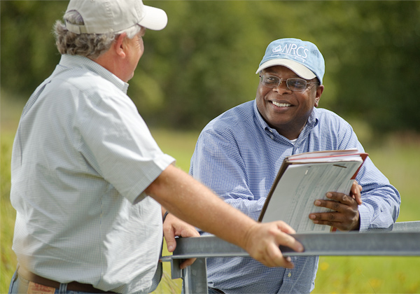
It seems simple, but it's really not and there are a lot of ways to screw this up. You can't depend on the staples of 'great photography' like dramatic light, perfect models, or something inherently captivating like a big storm, car crash, or celebrity. It is by design going to be undramatic. We're not going to win a Pulitzer with this, but nevertheless, it needs to fulfill the client's requirement of showing dialog, something that is a little abstract for a still image. Because of the way it will be used, the photo needs to have many of the qualities of a stock shot, but with people and a situation relevant to the client.The solution:
- Think about the story the photo needs to tell and how a film director might represent it on screen. When showing dialog, directors almost always choose the over-the-shoulder shot. It's such a major part of the vocabulary that it's normally referred to simply as OTS. I have never seen this term in a photography book, but once you start to notice it, you will see it in every film and TV show during dialog scenes. Viewers of the photograph will understand immediately what is happening simply because of the framing, which, whether they know it or not, is very familiar to them.
- Direct the subjects to look directly at each other creating an invisible line of sight connecting them. This reinforces the idea of communication.
- Use a long lens to simplify the scene, create a flat space, and fill the frame with a simple color palette.
- A wide aperture creates a shallow depth of field preventing background details from intruding into the space between the people and interfering with the main objective of showing dialog.
- Crop the person on the right at the top of the frame making him visually less prominent while framing and focusing attention on the main subject.
- Deal with harsh, midday sun with reflectors and fill flash, but keep it subtle.
You can learn all of this in a beginning cinematography book and almost none of it in one written for photographers. If you are still looking for a rule, at the very least switch out the old rule of thirds for the new and improved diagonal method where you'll discover that artists have traditionally placed the important elements, mostly eyes and nipples, in a different place than the rule of thirds would have you believe.