Some Notes on Saturation
Printing an image like the shot above, where most of the interesting detail is in the shadows can be very challenging. It's a challenge many people avoid, choosing instead to brighten and saturate the image to a point that, to my eye, looks artificial. It happens more these days than it did when people made c-prints in the darkroom.
by Mark Meyer · Posted in: digital alterations · photography techniques · tech notes · color
An image like this is more satisfying in print than on the screen—I really don't like the way it looks here, but I'm very happy with the print. We have learned to have different expectations from the monitor, which after all resembles a television; we are not used to lingering over the monitor like we are a print. Also shadows in a reflective medium are entirely different than in a transmissive one. And so we try to make it more satisfying, but often before we've really given thought to what that means. We try to increase ill-defined abstract attributes as if they were truly qualities of perception—we try to add some impact, or make the image pop. These terms don't mean anything and usually get translated into contrast and saturation because those are the sliders within arm's reach.
The tools we use effect us more than we like to admit. We are so accustomed to working on computers that we tend to forget that the interface of a modern operating system is little more than a set of visual metaphors. And like all metaphors the correlation between the original idea and the target is not complete and can mislead us. When we teach complex things like digital photography we get tied up in the metaphors because we tend to teach the tool rather than the concept. There are countless books on the market that will walk you through every menu and palette in Photoshop but leave you fairly ignorant of basic color concepts that most beginning painters will intuitively understand the first time the mix paints together.
Let's look a little more closely at one of these concepts: saturation. Both Photoshop and Lightroom offer sliders which manipulate saturation. Looking at the tool, we come away with the idea that saturation is measured on a uniform scale from 0 to 100 and that any color on the computer can have a saturation of any of these values. But it doesn't take long to see that photoshop will let you specify a very dark blue with 80% saturation and dark blue with 10%, but they look almost identical, whereas a light-red at 10% saturation is considerably different than light-red at 100%. There are times when a difference in the slider does not correspond to the same difference in color appearance. The tool also suggests that saturation is an independent quality, which can be misleading when we try to obtain realistic results. We see this all the time when photographers try to add "punch" to their images or make them "sing" but quickly turn them into cartoons. The reality, if we can even use such a word when talking about color, is that saturation is one axis in a color model, which itself is a tool, a geometric metaphor, to help us understand, standardize, and talk about the way we perceive color.
Saturation is often defined as the purity or intensity of a color. A manilla folder and a banana are more or less the same hue, but the banana seems like it has more yellow—it's not darker, it's just more intense. You might say it's more colorful, but here is where we meet the menagerie of misused terms. Color scientists use several terms to talk about what the Photoshop generation just calls saturation: colorfulness, chroma, and saturation. They are distinct ideas and although related are not interchangeable if you want to use them precisely.
Chroma is the term originally used by Albert Munsell at the turn of the century when he characterized color in terms of lightness (he called it value), hue, and chroma. It's a familiar word to soil scientists who still use the Munsell system when talking about color—don't call laterite dark red, its 5YR 5/6, it has a chroma of 6. Painters also still use the Munsell system. They manipulate the chroma of a hue by mixing the complementary color. As the proportions of complementary colors approaches 1/1 the color approaches grey. You can also change the chroma by adding white or black, but this simultaneously changes the lightness. This makes the correspondence between chroma and purity of a color very clear—the chroma is generally at its highest right out of the tube and decreases as you dilute it with other pigments. Despite what the photoshop color picker might lead you to believe, not all hues can achieve the same chroma. Reds can achieve high chroma values beyond what blue-greens can. You can see this on the Munsell Color Tree; not all the branches are of the same length. In the70s, when George Joblove and Donald Greenberg described the HSL (Hue, Saturation, Lightness) color space, they described saturation as relative chroma because the model defines saturation as the ratio between the chroma and that hue's maximum possible chroma. They essentially normalized chroma and called it saturation. But HSL as defined in the 70s is not a particularly good way to talk about color—it was designed to be computationally simple and is nothing more than a transformation of RGB space, which means that it is device dependent. Today when color scientists work on a color model like CIECAM02, saturation is defined as a color's colorfulness divided by its brightness. With this in mind, you can see the relationship between colorfulness, saturation and brightness in the color picker when you set a constant saturation. All of these color are defined as having a 100% saturation. As you move lower the brightness decreases, but note also that the colors get duller even though the saturation is constant. This is because the colorfulness decreases in proportion to the brightness while saturation remains constant
The Photoshop color picker set to 100% saturation. Hue is on the x-axis, lightness on the y-axis.
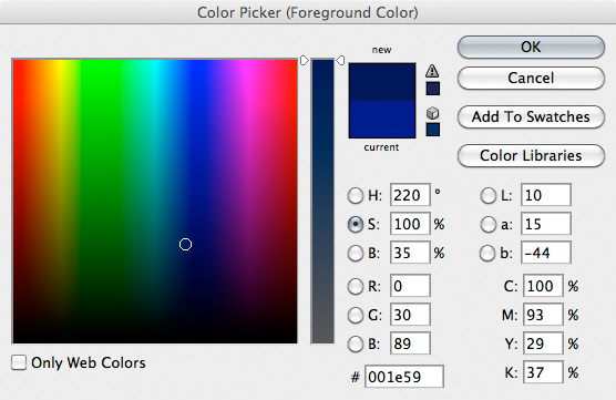
To really figure out what you are seeing here it also helps to understand the distinction between brightness and lightness in color models. Munsell was trying to describe perception, not color in absolute terms. If I have a grey card in my dimly lit office I can measure the amount of light reflected from the card with a spot meter. Now if I take the card outsider and measure it again, the spot meter will show a dramatic increase in reflected light. But the card still looks grey. In other words, its lightness has remained constant while the brightness increased. Brightness is an absolute measurement, I can measure it with the spot meter, while lightness is relative. It's a fascinating phenomenon because if I could somehow make the grey card emit the same amount of light inside as it does outside it would look brilliantly white. The moon exhibits this phenomenon—it is actually a rather dark grey, but because we see it at night illuminated by direct sunlight its lightness appears to be almost white.
Like lightness, chroma is also a relative concept. It is generally defined as the colorfulness relative to something that appears white under the same lighting. Like brightness though, colorfulness is an absolute measurement. A set of pantone chips doesn't appear to radically change colors when I increase the light levels, but the colorfulness changes dramatically. So while chroma is the color intensity relative to ambient light, saturation is color intensity relative to its own brightness making it a rather odd sort of metric—not nearly as intuitive as we might have thought. Generally when people talk about saturation, they are talking about chroma.
There are other subtly different ways of speaking of color intensity. The Scandinavian Colour Institute developed a system called the Natural Colour System. This system is based on three opposing pairs of pure primaries, white-black, red- green, blue-yellow. The choice isn't arbitrary, it reflects the biology of the eye. If your familiar with LAB color space, these opposing primaries should seem familiar. Colors (eh, I mean colours) are specified by how much they resemble the elementary primaries—their yellowness or whiteness. A dark teal color represented in sRGB space as [39, 142, 159] is notated S 3040-B20G in NCS. The notation is all about degrees of resemblance; the first two numbers are the percentage resemblance to black, the next, which they call chromaticness is the degree of resemblance to the maximum chromaticness, and then the hue, in this case the percentage resemblance to Green and Blue. Colors with the same saturation are defined as having a constant relationship between chromaticness and whiteness. The NCS website has some fun products and educational material. While we are teaching our kids that Indian Red is no longer a polite color (named after Laterite soils found in India incidentally, not Native Americans) and should now be called Chestnut, Scandinavian kids are becoming color opponent process experts.
It's late on a Friday, and my birthday, so I'm going to forget Munsell, the 6-year old Scandinavian pigment scholars, and the semantics of color names; the only colors I plan to concern myself with are those which can be measured on the Lovibond tintometer.