Colorists have more fun—Photoshop’s missing color tools
Digital tools for quantifying color have always been more advanced in video software than in software aimed at still photographers. Now with Adobe’s Creative Cloud, photographers can finally take a look at what they’ve been missing.
by Mark Meyer
The news is out: Adobe is moving to a subscription model called 'Creative Cloud' for almost all its professional software. CS6 will be the last Creative Suite with a perpetual license that you can purchase once and use until you upgrade. In the future you'll be renting it. Whether we're brave explorers of a new world order or serfs bound to Adobe's manor is a hornet's nest I'll leave to the pundits to kick around.
Adobe has structured the Creative Cloud in such a way that subscribers get a lot of software — more or less everything. So for many of us this is the first chance to kick the tires of software that we've never needed enough to justify purchasing. This includes tools for animating web content, writing screenplays, and color grading. Ah, color grading…the empyreal heights of color correction.
Color grading is a term normally reserved for film and video. It's the art of manipulating color both for accuracy and emotional effect analogous to the color manipulation photographers do in photoshop or increasingly in applications like Instagram. Color grading is performed by a colorist, who with the film editor is one of the unsung heroes of Hollywood. The colorist often plays a very large role in the look, feel, and emotional impact of a film.
Now that Creative Cloud is being pushed, it's easy to take a quick peek at what we as photographers have been missing in this mysterious world of color grading. Adobe's color grading software, SpeedGrade, is now available to download as part of the standard subscription.
While you can open, work on, and export still images in SpeedGrade, it's designed for working on motion footage and is not particularly efficient for photography. Nevertheless, there are a couple reasons why a photographer might want to spend a little time playing with it, especially if you're already paying for it.
Looks and LUTs
Photoshop CS6 introduced a new adjustment layer called 'Color Lookup.' This lets you to upload 3D lookup tables to alter colors and create specific looks. As the name suggests, a 3D lookup table, or 3DLUT, is a matrix that uses one color to lookup another. They are the basis for a lot of color management and allow almost unlimited freedom to manipulate color. Photoshop comes with a handful of preset looks, but has no mechanism for creating your own. SpeedGrade, however, does. All the color adjustments you make in SpeedGrade can be saved as a .look file or various formats of LUT, which photoshop can load in the color lookup adjustment layer. It's an interesting way to quickly package certain looks and use them the same way you would use any other adjustment layer.
For example, here's a before/after using a look I created in SpeedGrade and applied as an adjustment layer in Photoshop. Admittedly, you could achieve this look quite easily in Photoshop or Lightroom, but this is a nice way to package looks and they can be applied as easily to videos as to stills. Since I'm a total beginner with SpeedGrade, I don't know if there are things you can do with it that would be difficult in Photoshop. (If you do, drop a note in the comments.)
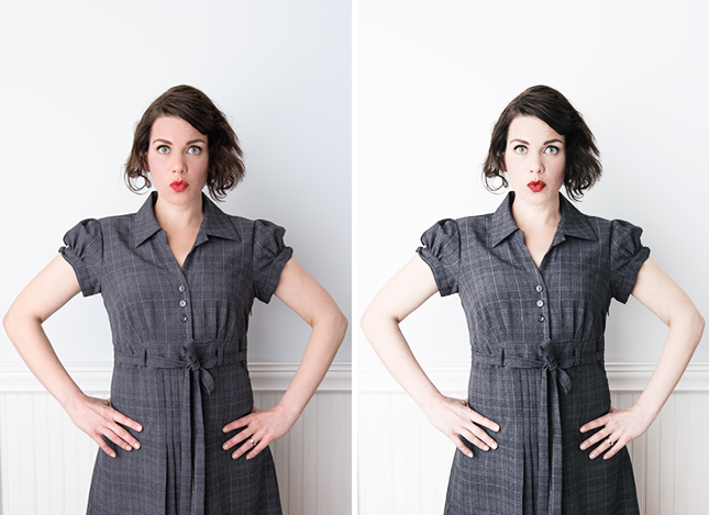
If you have Photoshop CS6, you can apply this look to your own images. Just download this 3DLUT file file, open an image, add a Color Lookup adjustment layer, use the drop down next to 3DLUT File to load it.
Beyond the Histogram
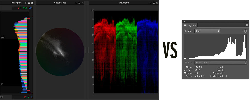
When it comes to color analysis, colorists have much sexier tools that photographers. We get the romance and mystery of the histogram, sure, but the colorist has waveforms and vectorscopes with graticules and reticles. It's straight out of Flash Gordon.
You probably already know this so I'll keep it brief: A histogram is a special kind of bar chart that shows how discrete data is distributed. For images, the data is the number of pixels on the Y axis of a particular value on the X axis generally moving from darkest on the left to lightest on the right. Here's a typical histogram.
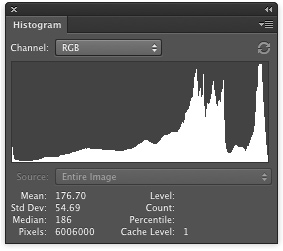
This shows some clipped blacks on the left, a lot of bright mid tones and highlights, and no clipped whites. Histograms are great for quickly seeing if you are clipping highlights and shadows, but they offer no information about where those values are in particular image.
In a waveform, on the other hand, the X axis corresponds to the horizontal location in the image with pixels distributed along the Y axis according to their intensity. So each vertical line of the image corresponds to a vertical line of the waveform. As you scan the waveform from left to right, you are seeing a scatter plot of the intensities of that part of the image. It's hard to explain but it's pretty clear looking at an example.
Here's an image (an iPhone video grab) with its waveform:
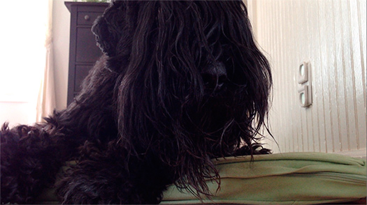
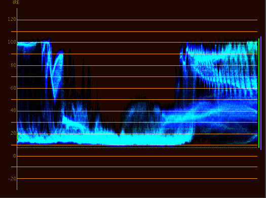
On the left of the waveform you see the highlights in the window clipping represented by the pixels bunched up at the top. As you move to the right you see almost nothing but shadows clustered at the bottom of the waveform. Then on the left a mix of mid-tones and highlights. You can even see the beadboard pattern in the waveform. Once you've learned how to read it, a waveform is a very intuitive way to see how contrast is distributed throughout an image and where clipping occurs.
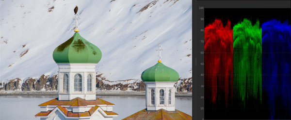
A waveform can also be separated into components laid out next to each other. When separated into RGB it's called an RGB parade—that's right, while photographers have been staring at histograms, colorists have been partying like rockstars with RGB parades. An RGB parade is just three waveforms representing each color channel. The RGB parade makes it very easy to see the color balance of an image. For instance, here is an image with a strong green color cast.
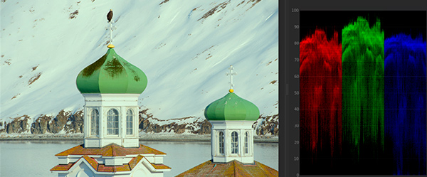
The green cast is clear—the entire green waveform is sitting higher in intensity than the other channels. This might be expected with a mostly green image, but not an image with a lot of white. To balance it you simple need to line each waveform up vertically.
While the cast is easily visible in this image, color casts can be hard to see when you are looking at images all day because of the way our eyes adjust to colors. Having an objective tool like this keeps your eyes honest.
With the convergence of all the Adobe tools into one big product, maybe we'll start to see features shared among them. I would welcome a waveform palette in Photoshop and Lightroom. And, while they're at it, it would be nice to have more accessible tools for working with lookup tables. Regardless of your feelings about the Creative Cloud, Adobe's future will be interesting and the current arrangement offers some truly amazing tools that will be new to a lot of photographers.