Crayons under the spectrophotometer
by Mark Meyer · Posted in: color
Most people have forgotten the mysterious questions that a box of crayons presents to a kid such as: what am I supposed to do with this useless white crayon? why is the yellow crayon so dark and greenish, but draws such a pure, light yellow? is it just my eyes, or are the paper wrappers on the blue, indigo, and cerulean crayons the exact same color?
I did not forget. These questions have been nagging me since kindergarten and this weekend I finally got to the bottom of it. I am now able to answer that age-old question: what really is the difference between green-yellow and yellow-green?
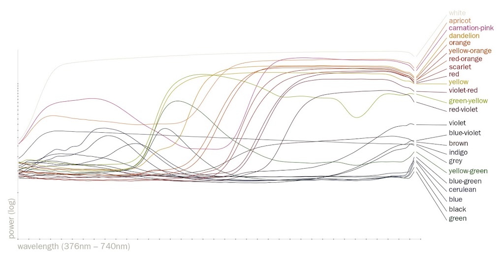
Starting with a fresh box of twenty-four Crayola crayons I measured each with an i1 pro spectrophotometer to create a set of spectral power distributions (SPD) of the reflected light. You may not know this, but a spectrophotometer is good for much more than creating screen and printer profiles—for instance, I can tell you with some precision the color of my tongue (and my dog's).
The image above is what a box of crayons looks like broken into it's spectral components.
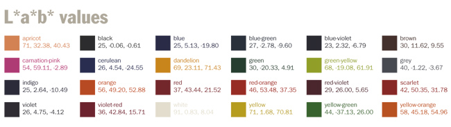
It seemed a waste to have this all in one place and not calculate the lab values
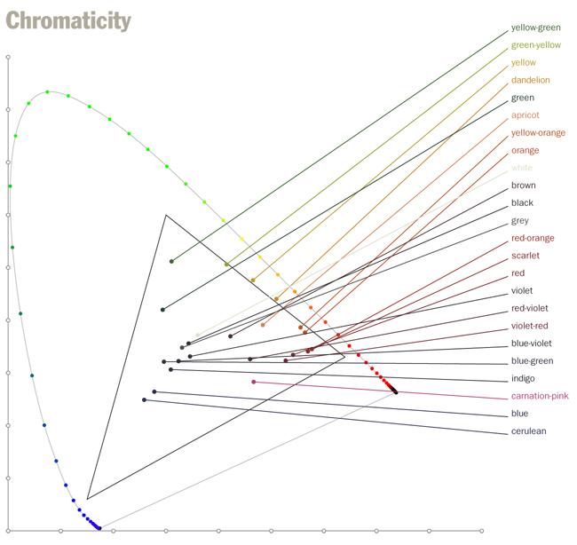
and also the xy chromaticity coordinates, which are plotted below with the sRGB gamut for reference.
A note on method
The measurements were made off the crayon itself, not the mark it leaves on paper. This is important because a single crayon is capable of many different shades. The material is translucent and gradually builds up toward the color of the actual crayon which is much darker than the color it leaves on paper. Obtaining the color of the actual crayon on paper has, since childhood, seemed an impossible feat.Extra credit for math geeks
In the chromaticity diagram above, knowing only the x and y coordinates of the dots, how do you sort the list of color names so that no lines cross? (They're currently sorted by the y coordinate.)p.s. The charts were created using Argyll CMS for the measurements and Nodebox for the designs, which is a terrific piece of software for creating just about anything visual with Python.