Hard Light
Go to any photography equipment store and ask for a basic portrait lighting kit. You will be handed a couple lights, stands and umbrellas and sent on your way. This keeps with the idea that large, soft, light sources are the standard portrait setup and are more flattering. But this is not really true.
by Mark Meyer · Posted in: tech notes
As an example, look at the cover photos on magazines known for high-value productions like Esquire or Vogue and more often than not you will see portraits shot with hard light sources—images with razor sharp, inky shadows. The reason most people start with umbrellas is not that they are better or more flattering, but that they are more forgiving—there are fewer ways to screw up a photo if light is sloshing around everywhere. You can worry less about retouching and makeup, and the margin of error in the placement of the light is huge. But learning with such a forgiving tool is not always in your best interest. You get very little feedback about the interaction of the light with the geometry of the face using a large source—large changes in light position and power often result in small, subtle changes in the photo. Use a small, simple source like a strobe in a reflector or dish, and you will quickly become intimate with the anatomy of the face and the nature of light. The difference of a few inches in light placement can create dramatically different photos. When you use the light poorly it will look awful, and when you get it right it will often create much more interesting, more dramatic portraits that stand apart from the hordes using the bland, umbrellas-at-45º recipe.
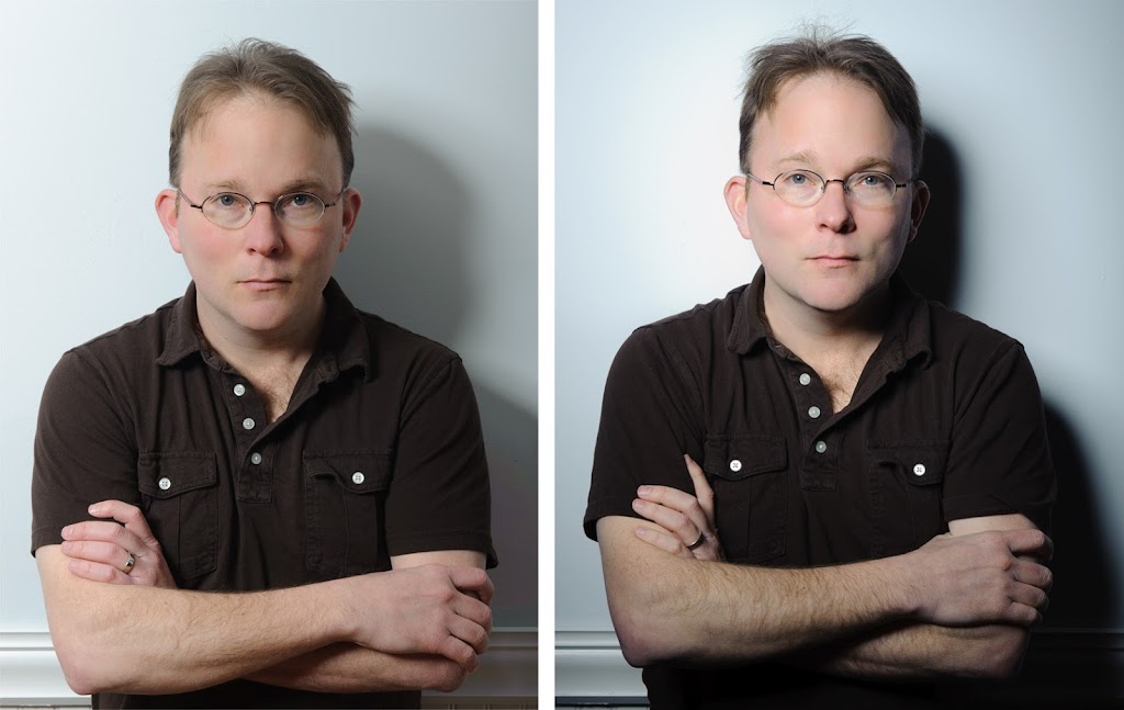
Nobody likes to show images that don't work, but pedagogically they are often the most valuable so in this instance I'm showing the dreadfully lit photo on the left (of myself, with bed-head no less) to show what a big difference a small change can make. These are lighting practice shots, so I'm concerned mostly light and shadow, not poses, hair, etc.
Both of these are shot with the same light: a single Profoto strobe with a softlight reflector. Both have minimal manipulations in the conversion from raw. The enormous differences in these shots reflects nothing more than the difference of about 2.5 feet in light placement. The shot on the left is bland and muddy and the shot on the right jumps out. If it wasn't for that frightful model, the photo on the right would be a workable image.
What's the difference?
Spill
This is shot in a small room. Many lighting tutorials are shot in large studio spaces where light that doesn't hit the subject is never seen again. In a small room light bounces off the walls and ceiling, often picking up color casts along the way, and ends up on your subject in places it wasn't intended. This is sometimes convenient, but it's hard to control. To reign in the spill I added a grid to the reflector which keeps the quality of the light about the same but narrows the angle of the light from 65º to 25º making it light a smaller area. You can see the difference very clearly in the density of the shadow on the wall. The edge of the shadow has the same hardness in each shot, but without the spill and unintended fill, the shadow on the right is almost black as one would expect from a single hard source. The color of the wall is also more accurate in the right because it isn't polluted with colors from the rest of the room.Angle
The photo on left has too much light under the chin allowing the chin and neck to merge. We want to define the chin line, even if only a little bit, and it's not happening very well because the light is placed too low. This is a common mistake. Raising the light about six inches creates a thin shadow that separates the jaw line from the neck. Bringing the light closer on axis (closer to the camera) puts a little more light under the shadow side brow line, prevents dark eye sockets, and makes the eyes a little brighter and more expressive. This also lets light reflect directly off the wall onto the shadow side of the face preventing it from merging into the shadow. If this didn't happen, we would need a touch of reflector on the shadow side of the face to give it a little definition. You can overdo this. Bringing the key light too close the lens axis starts to approach that ring light look, but the almost-a-ring-light look is rarely what we want in a portrait. We want enough shadows to articulate the features of the face making the expression easy to read while avoiding shadows that become distracting.Distance
The Profoto softlight reflector is slightly focused and has a sweet spot in the area of two to three feet from the subject. It is an amazing light modifier, but you really need to get to know it, which was the point of these shots. Bringing the light closer to the subject gives the photo on the right the look that is associated with dish reflectors—round catchlights in the eyes, subtle specular highlights on the skin, and a smooth but contrasty character. Placing the light closer with a grid on it also creates a natural vignette giving the plain, blue wall a little character and making the face brighter than the hands and arms.Had I shot this with a big umbrella in this small room I could have put the light almost anywhere and the photos would all look pretty much the same. If you're happy with that look, great, it's easy to do. But if you're not, the umbrella doesn't give you much control, especially in a small space. One or two hard sources on the other hand give you a wide range of expressive possibilities, but it takes some practice. Often shooters will try working with umbrellas, over light their subject, and then try to get a crisp, contrasty image in post-production. This usually leads to disaster and it's a lot more work than just lighting for the look you want.
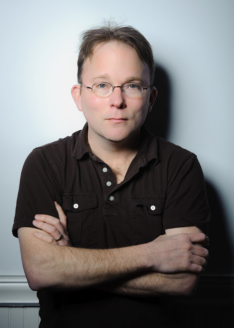
Here’s a larger version