Analyzing Photoshop Vibrance and Saturation
One of the new features in photoshop CS4 is a Vibrance adjustment, a feature borrowed from lightroom's development module. It's fairly intuitive to use, but have you ever wondered what exactly this handy little adjustment does? Unlike saturation or hue, vibrance isn't a component in any color model that you can measure and there are no formulas one can apply to calculate vibrance from RGB values; vibrance as such doesn't exist.
by Mark Meyer · Posted in: tech notes · nerdiness
Here's what Adobe's documentation has to say:
Vibrance: Adjusts the saturation so that clipping is minimized as colors approach full saturation. This setting changes the saturation of all lower-saturated colors with less effect on the higher-saturated colors. Vibrance also prevents skin tones from becoming oversaturated.
This is probably all you need to effectively use this control, but nevertheless, in an effort to see what is really going on, I made some plots to compare the saturation tools available in photoshop: vibrance, and the two saturation sliders found respectively in the vibrance adjustment panel, and hue/saturation adjustment panel.
Lets start by looking at the old Photodisc test image and apply the three saturation controls at 100% and 50%.
Original 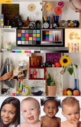
|
50% Vibrance
|
100% Vibrance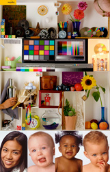
|
| **Saturation using the Vibrance Panel** | |
50%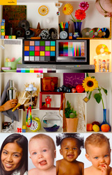 |
100%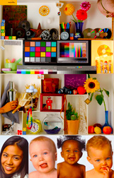 |
| **Saturation using the Hue/Saturation Panel** | |
50%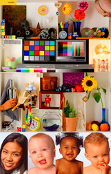 |
100%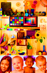 |
It becomes immediately apparent looking at these images that the two different sliders called saturation are very different. The saturation slider in the Hue/Saturation adjustment is a blunt, heavy handed tool, and although they share the same name, the saturation slider in the vibrance panel shows a certain amount of restraint. Also, it is very clear that the vibrance control behaves as you would expect. Even at 100%, it is only just begining to get out of hand. Punchy, sure, but not completely over the top and with very little clipping.
Now lets make some scatter plots of the saturation data. I am going to look at the raw saturation numbers of the original file on the x-axis ploted against the saturation number after the various contols have been applied on the y-axis. (In case you are a little rusty on this sort of graph, remember that a 45º line indicates the data is the same.)
| Vibrance vs. Original | |
50%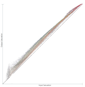 |
100%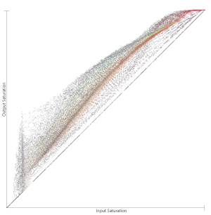 |
| Saturation Slider in the Vibrance Panel vs. Original | |
50%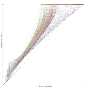 |
100%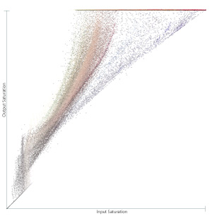 |
| Saturation Slider in Hue/Saturation Panel vs. Original | |
50%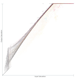 |
100% |
A few observations
The two saturation sliders are vastly different control. The horizontal line at the top of the graphs shows pixels that have been driven all the way to 100% saturation where they clip. At 100% saturation using the Hue/Saturation slider almost no value that started beyond 15% is left unclipped. Also, if you look closely at this graph you can see a couple splotches of somewhat pure cyan, magenta, and yellow that have not been pushed all the way to 100%. I suspect this is showing the gamut limit of our particular RGB space. Note that the vibrance slider does allow some clipping at the far end of the graph. You can also see how the effect of the vibrance control is stronger on some colors than others. In the middle of the graph the pixels split into a sort of rainbow with the blues and greens pushed higher than the flesh tones. The most surprising graph for me the saturation slider in the vibrance panel. It shows an exponential effect on saturation versus the linear effect of the hue/saturation control, but still seems to make some distinction based on input hue.Note: Graphs created in NodeBox. Saturation separations made with Mathematica.