iPhone 5 Color
It looks like the new iPhone has a screen that corresponds closely to sRGB. Too bad the operating system is still not color managed.
by Mark Meyer · Posted in: tech notes · nerdiness · color
When Philip Schiller was describing the new specs of the latest iPhone during Apple's September 12 event one passing comment caught my ear:
This display has 44% more color saturation than the iPhone 4s display. And if you know about this stuff, this takes us to full sRGB color specification.
This is the first time I can recall hearing apple mention a color space when talking about their mobile devices and it got me a little excited because I thought maybe, just maybe, iOS devices would finally be color managed. Well they're not. You can verify this by looking at this post in the iPhone browser. The picture below is an RGB images, but it has a funky icc profile attached that makes it appear black and white. If you see it in color it's because your browser is ignoring this profile and just throwing the RGB numbers at the display.
This photo will be black and white in color managed environments
This image shows up in color in all the standard iOS apps—in other words, iOS apps are ignoring the color profile. (One note: if you upload images through iTunes' sync, they will be converted to sRGB on the fly).
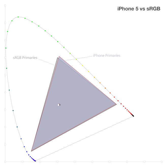
This is a bummer if you hoped to work with color managed images on the iPad or iPhone. But all is not lost if you want to accurately display images on the web and mobile portfolios, or if you only work with sRGB data. The reason is that Philip Schiller wasn't exaggerating. The screen really does conform very closely to the sRGB spec—at least based on a quick (and unscientific) test.
A Quick Test
I measured a few patches on the iPhone with an i1 pro and ArgyllCMS's spotread. It's a very casual test that measures full saturation patches of red, green, and blue as well as white to get a rough estimate of where the primaries and white point sit on the chromaticity diagram. This is what I found:
| iPhone | sRGB | |
| White | [0.306616, 0.326052] | [0.3127, 0.3291] |
| Temp.(CCT) | 6872K | 6503K (D65) |
| Red | [0.637088, 0.332832] | [0.64, 0.33] |
| Green | [0.309623, 0.607737] | [0.3, 0.6] |
| Blue | [0.150282, 0.063063] | [0.15, 0.06] |
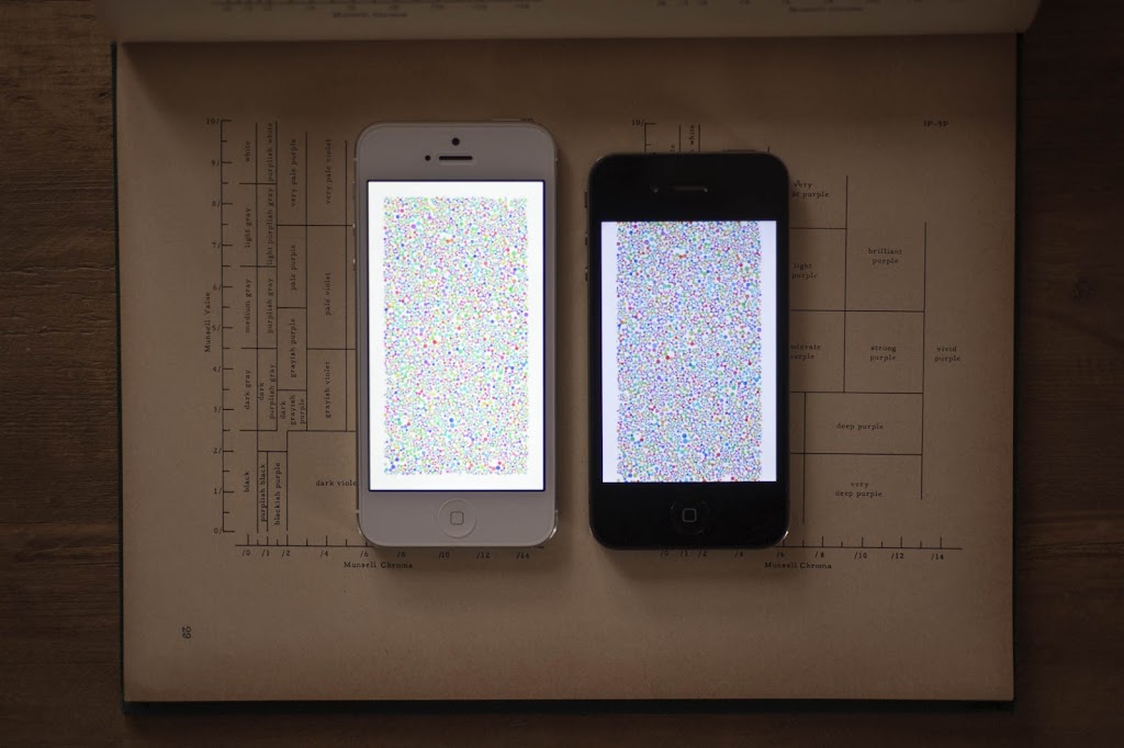
It's pretty close to the sRGB spec. The most noticeable difference is that white is a bit cooler than D65, but it's much warmer than my old iPhone 4 (compared in the top photo).
Here it is on the xy chromaticity diagram: