My life as an undirected graph
by Mark Meyer · Posted in: musings · nerdiness
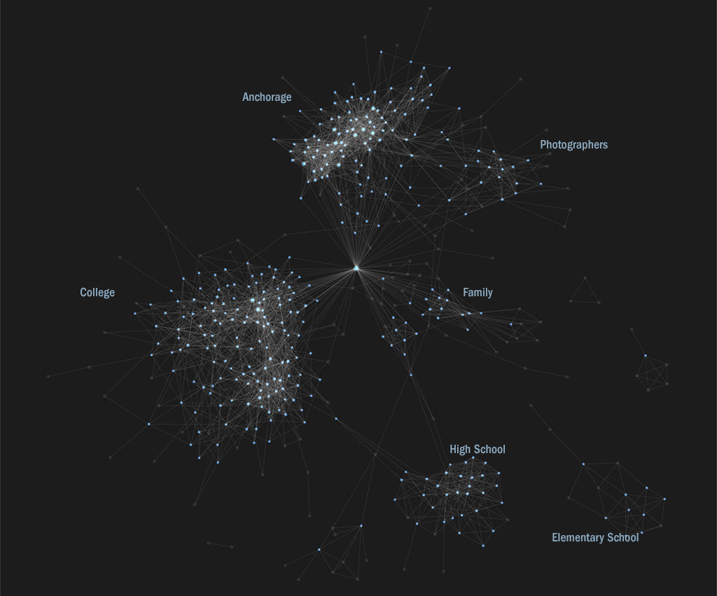
The above image is a graph of my Facebook friends and the friendships between them. It was created using nodebox, one of my favorite utilities for creating visualizations. I removed the names to protect the innocent (and paranoid), but left the connections between people. Each circle, or node, in the graph represents a person. The lines, or edges, of the graph represent friendships. The algorithm that decides where to place each node is based on the connections. The nodes are assigned a force to repel each other, but the edges create an attraction between the nodes they connect causing a clustering effect so that nodes that are tightly connected are pulled into groups. I removed my own node from the graph because it's redundant—I'm by definition connected to every node. The node that looks like it occupies a central spot is appropriately Jessica, my wife, who seems to know a lot more of my friends than I realized. The graph self-organizes into tidy chronological clusters with a handful of unconnected satellites representing groups of people who I've casually met along the way. This tendency of a graph to form groups of highly connected nodes is called assortative mixing and it's something that makes social network graphs special and useful for applications from counter terrorism to politics to advertising—for instance: Graph Theory, Social Networks and Counter Terrorism (1MB PDF). The major groups are labeled, but within these groups subgroups are apparent. Looking at the college group, older students are more sparsely connected toward the left and younger students who I met when I was working at the university are tightly connected on the right. Within the younger group two sub-clusters are noticeable: one group is mostly instrumentalists and one group is mostly vocalists. This accurately represents the social structure of the school, at least at that time. Although quite densely connected, the Anchorage group also has two noticeable clusters. The one on the lower left consists of people who I know and who know each other through various social networks like Twitter, while the one toward the upper right are people from the Anchorage design, advertising, and photography world.
With almost no other data you can tell a lot about me simply from the topology of this graph. Add to this all the metadata such as 'likes', status updates, clicks, photos, and GPS check-ins and it becomes unnerving that so much well-organized data resides with one corporation. And this is merely a social graph of me and my associations one degree away; imagine the graph of all 500 million-plus Facebook users all of whom have self-generated the edges of their personal graphs and are actively adding more metadata. The amount of information and the power to harness it is truly unprecedented, but it is easy to ignore until you see it laid out in front of you.
Incidentally, Facebook has announced that it may have an IPO in April of this year. (My birthday is in April and I'll gladly accept Facebook stock.)