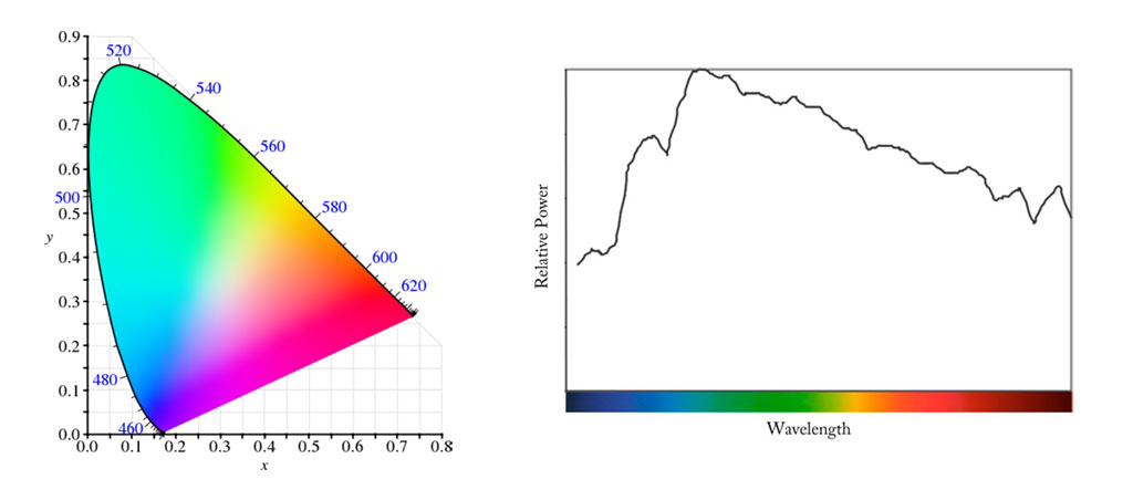
Deconstructing Chromaticity
by Mark Meyer · Posted in: tech notes · theory · color
A little background
When you pass normal light through a prism, it is split into it's component parts—the 'pure' or spectral colors. A spectral color is one that is made of light of just a single wavelength. If you direct a pure spectral light source, like a laser, through a prism, it doesn't spilt into more colors, it just bends. For any given non-spectral light source it's possible to split it into discrete components and measure the power of each. This is what a spectrophotometer does. You can then plot it on a graph with the wavelength on the x-axis and the power on the y-axis. It's a common way of specifying light sources like lightbulbs. A similar system is used to classify stars. Here's what such a graph looks like:Spectral Power Distribution (D65, similar to daylight)
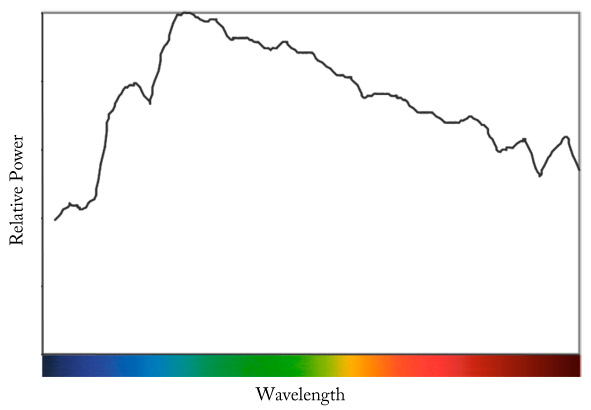
This is called a spectral power distribution (SPD) and it's an objective way of measuring the color of light. By objective I mean that it doesn't depend on the biology of our eye or the vagaries of human perception. The color is specified in dependable metric units like watts and meters. But the interesting and difficult thing about spectral power distributions is that they don't uniquely identify a color appearance. You can see a color that appears green with a SPD made up of light all centered around the green area of spectrum that looks identical to a color with a SPD with peaks in the yellow and blue parts of the spectrum but no green whatsoever. This is because we don't see color in terms of spectral distribution. We see color using the three cone receptors in our retina each of which has different sensitivities to different wavelengths of light. It doesn't matter how you stimulate the cones—it can be a smooth spectral distribution with a bit of light from every part of the spectrum or it can be just a few pure colors mixed together. In fact it only takes three pure colors in varying powers too mimic most of the colors we can see. This is the basis of modern colorimetry and it's how monitors, televisions, slide film, and printing presses are able to use a few pure colors mixed together to give us full-color reproduction. In order to do this predictably, however, you need to know how the cones responds to different parts of the spectrum. How, for instance, does our visual system react when it is exposed to pure 633 nanometer light from a typical helium-neon laser. This is what the color matching experiments of William David Wright and John Guild did back in the 1920s. They asked their subjects to match spectral colors by varying the relative strength of three primary colors mixed together. In 1931 the International Commission on Illumination, (Commission internationale de l'éclairage in French and hence it's common acronym CIE) normalized Guild and Wright's data giving us what has since been known as the 1931 Standard Observer (This was a little more involved than I'm implying here, but that's for another day). The 1931 Standard Observer is just a table of data organized into rows for wavelength, and columns for the power of the individual primaries. But it's very important because it provides the link between spectral power data and how we actually see and can reproduce color—a link between radiometry and photometry. At the same time it corrals color which might result from many different spectral power distributions into one specification. You can download an excel spreadsheet of the 1931 data here along with a very detailed account of how the CIE dealt with Guild and Wright's numbers.
Color Matching Functions
One way to view the 1931 standard observer is to chart the data the same way we charted the SPD, but instead of power on the y-axis we plot how much of each primary is needed to match the wavelength indicated on the x-axis. This creates one line for each primary.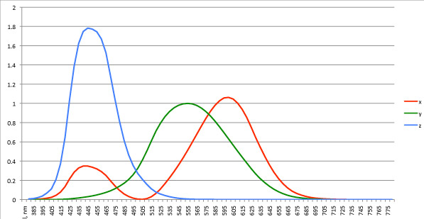
Another way to visualize the data is to plot it in a three dimensional space with each column of the CIE data getting its own axis. It's a little hard to visualize 3D data on a screen, so I've animated it.
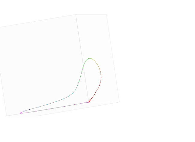
If you were to put a point at 1.0 on each axis and connect the dots you would get an equilateral unit triangle. Lets look at what happens now if you take each point from graph above, draw a line between that point and the origin of the graph, and plot where the line would intersect the triangle. This will create a two-dimensional projection on the unit triangle.
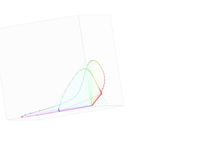
Look at that! It's the outline of our chromaticity diagram. It's shape comes from the 1931 standard observer data, which in turn comes from the way the cones in our eye react to different wavelengths of light.
This projection is very easy to do mathematically too. Given each row of data, which look like this:
| wavelength | x | y | z |
| 380 | 0.001368 | 0.000039 | 0.006450 |
Simply calculate x, y, z using the formula
the CIE was really into only using variations of x,y, and z variables, I have no idea why:
x = x/(x+y+z)
y = y/(x+y+z)
z = z/(x+y+z)
Although it looks like you still have three dimensions of data, notice that x+y+z will always equal 1, which means that z can be defined in terms of x and y (z = 1 - y - x). There are only two independent variables. When we do this for each row of the 1931 data and plot x and y, we get the same shape we saw in the three dimensional projection. It's so simple that you can chart it in an excel spreadsheet, which you can download here. The chromaticity diagram is just an expression of the 1931 Standard Observer Data projected onto a plane.
What good is it?
Keep in mind that the chromaticity diagram disregards an entire dimension of data. As such, points on the graph don't represent individual colors but rather a range of colors. To get a specific color you need to reconstitute it by adding lightness data. This is what CIE xyY space does. Still, like a two-dimensional map, the chromaticity diagram is useful for visualizing color.One of the most interesting properties of the chromaticity diagram is the way it shows how colors can be mixed to create new colors. If you take any two points in the graph and draw a straight line between them, this line will represent all the colors that can be created by mixing the colors represented by the two points.
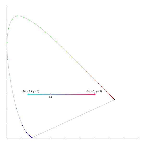
Above, mixing the colors c1 and c2 in varying proportions will result in any of the colors along the line between them including c3. It becomes obvious that c3 could just as easily be created by mixing any other two colors that are collinear with it. Colors that appear the same but are made of different components are called metamers and the ability for many different mixes of color to result in the same color appearance is called metamerism. The important thing is that regardless of the components, the chromaticity coordinates stay the same. This is the real value of the the CIE XYZ space and colorimetry in general: Regardless of the SPD or the components that make up a color, an individual color will be specified with one set of coordinates and one set of coordinates specifies one color. Although not as objective as a power distribution it is much more useful for color reproduction.
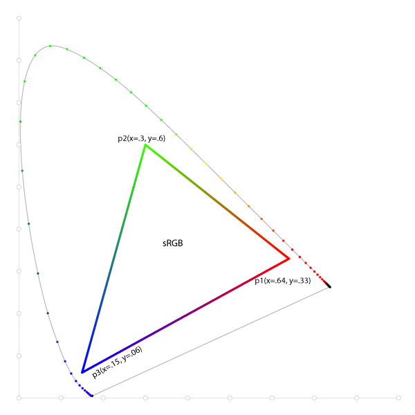
Suppose instead of two points and a line, we picked three non-collinear points and created a triangle. Like the line above, the colors along the edge of the triangle can be formed by mixing the two primaries bordering the edge. The area within triangle represents the colors that can be created by mixing various proportions of all three primaries. Colors outside the triangle are out of gamut—they cannot be made at all with these three primaries. This is what you see when the chromaticity diagram is used show gamuts of color spaces and monitors. Simply plot the three primaries of color space and you can visualize the gamut. For instance the primaries of the sRGB color space are R(.64, .33), G(.3, .6), B(.15, .06). If you plot these points on the diagram and connect the dots you get this:
It's worth remembering though that we created the chromaticity diagram by tossing out one dimension of data and it provides an incomplete picture. You can't specify a specific color using only the two chromaticity coordinates. Mark D. Fairchild in his book Color Appearance Models, warns us about using them for precisely the purpose we most often see them used:
The use of chromaticity diagrams should be avoided in most circumstances, particularly when the phenomena being investigated are highly dependent on the three-dimensional nature of color. For example, the display and comparison of the color gamuts of imaging devices in chromaticity diagrams is misleading to the point of being almost completely erroneous.